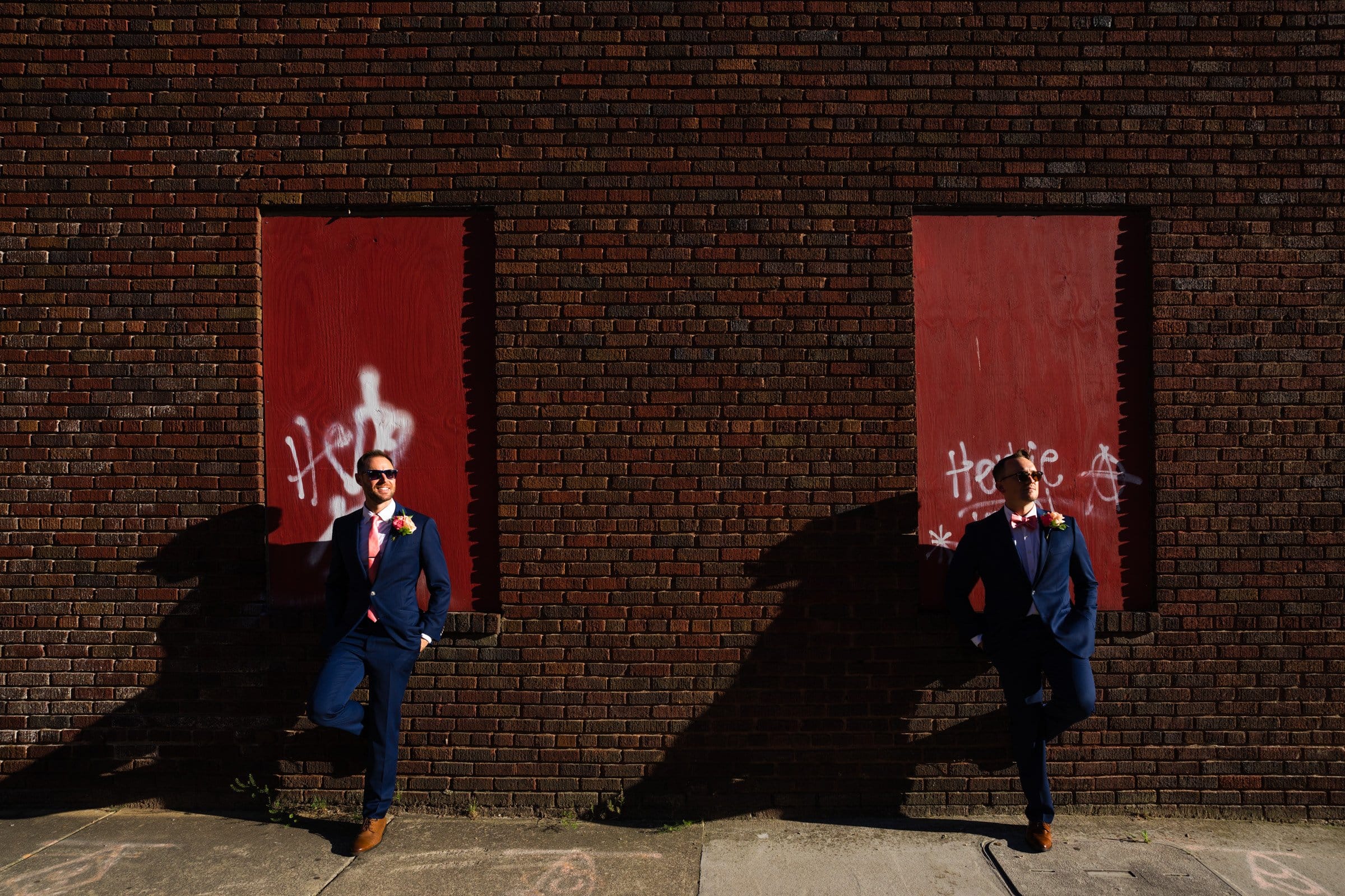
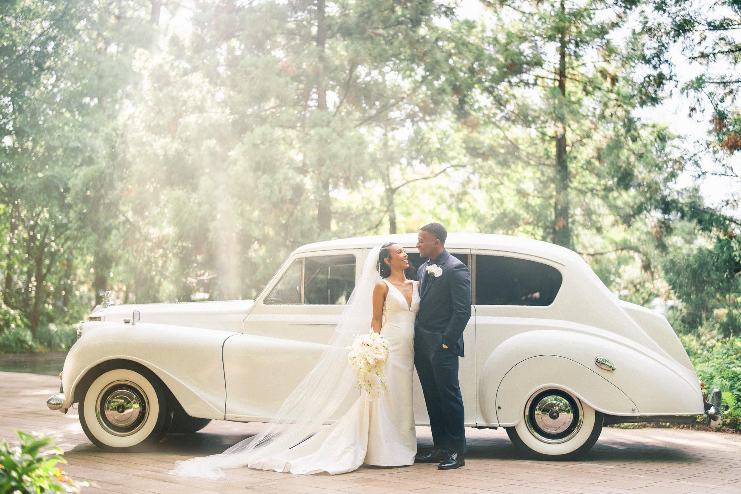
One of the things that will help your pictures stand out from the crowd is to have a knowledge of the basics of setting up an interesting image. This is easier said than done, but the main areas I would recommend focusing on are as follows:
~ Identifying your subject
~ Using “The Rule of Thirds”
~ Making the most of “leading lines”
Identifying your subject
When I started out taking pictures, I didn’t really spend too much time working out what it was I actually wanted to photograph. I would see something I thought looked pretty and fire away. Obviously, when you’re taking portraits, it’s easy to work out what you’re shooting. When it comes to landscapes or interesting architecture or something a bit more abstract, you need to work out what you want in the image.
Probably more importantly, you also need to work out what you don’t want in your picture. Is there something in the frame that is distracting or adds nothing to what you want to capture? If so, you need to have a think about that and frame your shot accordingly. Ken Rockwell (whose blog I read quite often for entertainment value as well as down to earth articles, gear reviews) has a good article on this side of things and he has come up with a clever (and amusing) acronym called FART which stands for:
~ Feel – The basic feeling you get when you see something you think looks interesting enough to photograph
~ Ask – Question yourself about what exactly it is that you see that you find compelling
~ Refine – Remove all the surplus stuff from the frame until you get the most powerful image possible
~ Take – Press the button and have a look at your masterpiece!
I would recommend reading Ken’s entire article and, though I don’t agree with everything he says, I would definitely check out his blog on a consistent basis if you take this photography lark seriously.
Using “The Rule of Thirds”
Before I got into photography, I, like most others, went the route of making sure my subject was slap bang in the middle of the viewfinder before taking a shot. This is what I was told to do by my parents when I took my first photo aged about eight, so that is what I did for the next 29 years without thinking too much about it. However, the next time you look at a painting of a landscape like Constable’s Hay Wain, you’ll probably see a concept called “The Rule of Thirds” at work. What the hell am I talking about? Let’s take a look at Constable’s masterpiece and see:
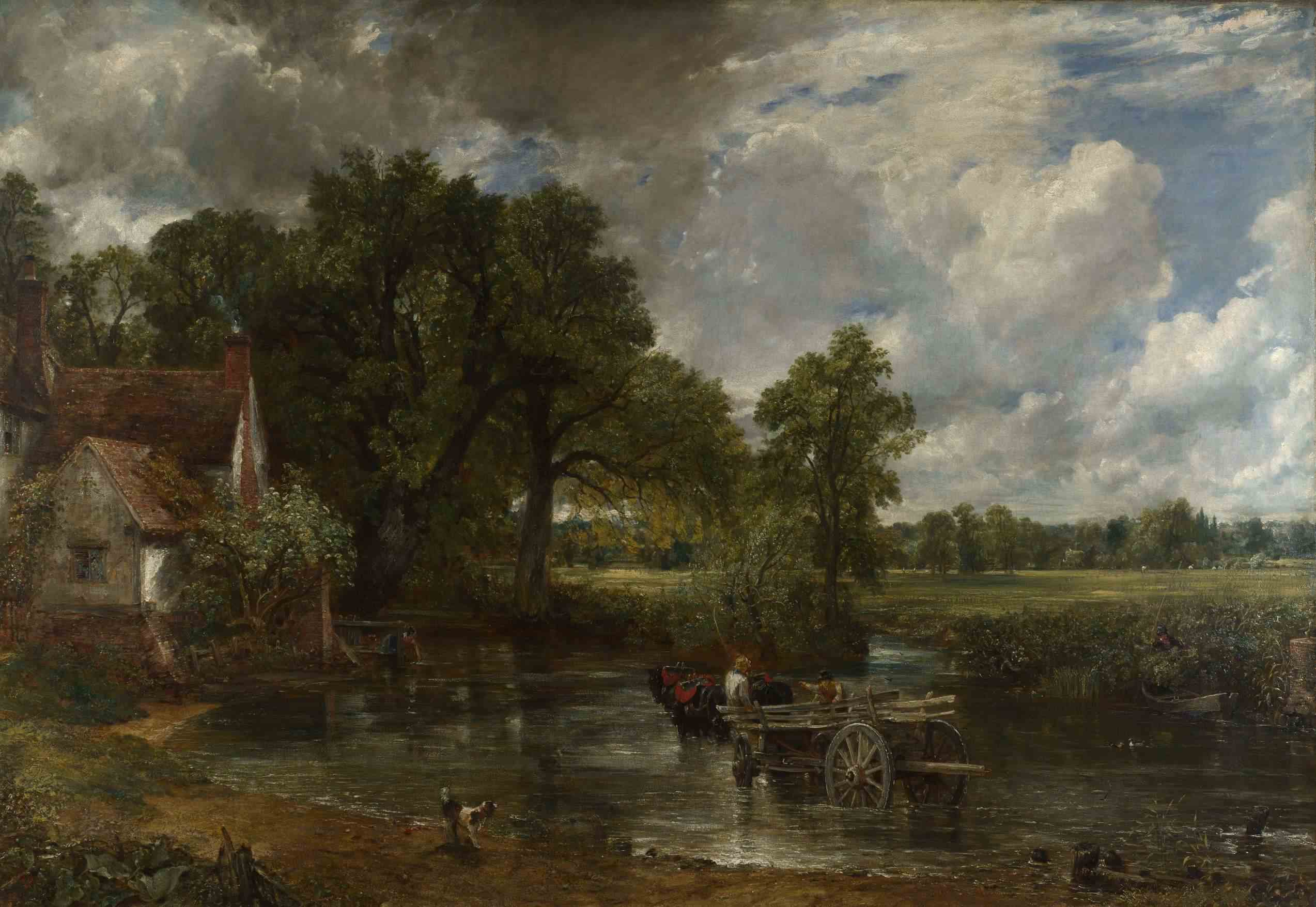
If you take the image above and superimpose a noughts and crosses (that’s tic-tac-toe for my American friends) board over it, you get the following:
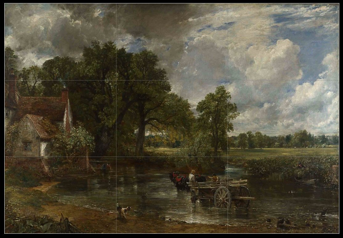
So we can see here that a lot of the composition falls into certain areas in the thirds of the board. The Rule of Thirds basically says that any points of interest should fall along these lines, with the most powerful points being those of intersection between the vertical and horizontal lines. You can see the wheels of the hay wain in question are positioned pretty close to this area, the Spaniel is positioned on another “third” line, the horizon is placed along a horizontal third line rather than in the centre (which is where most people place it when taking photos). There are loads more examples in this picture if you look for them (the mill is placed in the far left third, the right-hand third shows the more distant landscape etc, etc.).
Constable also made sure to include a foreground (the near shore with the pooch), a middle ground (the hay wain, river, mill, etc.) and background (fields, trees, sky and clouds). Most people, when they see a landscape that they want to photograph, will normally exclude the foreground and just shoot the middle ground and background. It’s worth looking around to try and find some foreground interest wherever you can. Rocks, pebbles, flowers, etc. all provide some extra visual interest.
Basically, this is the sort of thing we need to think about when framing our shots and what I look for when I’m trying to make something better than average. Here is an example of a photo I took this morning where I tried to bear the Rule of Thirds in mind while setting up – it’s not quite the Hay Wain, but it’ll do! :) :
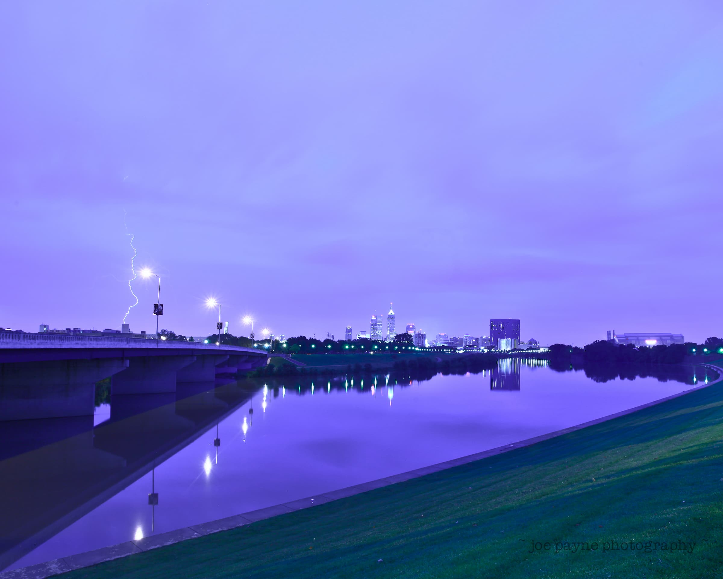
OK, so here the subject for me was the Indianapolis skyline at dawn reflected in the White River. You can see I placed the New York Street bridge in the left-hand vertical third, the horizon is placed on the lower horizontal third, Lucas Oil Stadium and the curve of the river are placed in the right-hand third, etc. The lightning was just luck! Here it is again with the noughts and crosses superimposed so you can see what I mean:
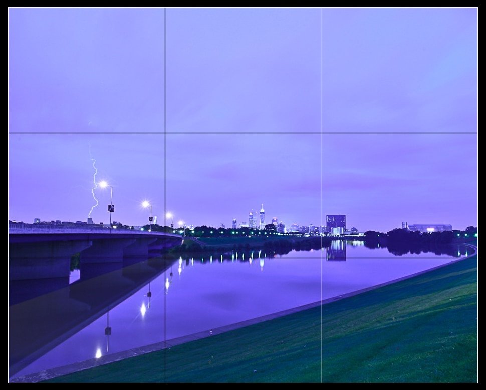
I also made sure to include a foreground, which though not exactly exciting, does frame the reflections well enough. If I go back and try this again, I would probably try to get the whole of the reflection of the far left-hand lamppost in the water though.
If your camera has a “Live View” mode on it, it probably allows you to superimpose a noughts and crosses grid onto the image which helps when setting this up (not to mention helping keeping the horizon and vertical lines straight, etc).
Making the most of “leading lines”
This is a bit easier to explain. When possible try to leverage any lines in your image to draw the viewer’s eye through the content of the picture. You’ll see the bridge and the curve of the river bank here set out to do just that.

The leading lines start out in the bottom left-hand corner with the bridge and the river bank and work their way up and across the image. The lines of the bridge, combined with the far and near banks, work to form a triangle, which aim to focus in, point and move the viewer’s eye through all the areas of interest.
Applying the above to portraits:
Probably the most important of these three concepts when taking pictures of people is the Rule of Thirds. Take a look at any headshots and you will usually notice that the eyes are positioned along the top third line of the image (sometimes even if it means cropping off the top of someones head). Here is a recent example:

Many people centre the eyes/face and leave too much room over the subject’s head. Likewise, if a person is facing a certain way, it is normally good to give them some room to “move into” in the image. Quick example for you:

OK, hope this wasn’t too long and rambling. Also, note that these are just examples and I have skated over a lot of stuff. Feel free to leave a comment if you disagree with anything or if you have any questions…
Cheers!
Disclaimer thingy – The Hay Wain image was taken from Wikipedia’s Creative Commons. Copyright is not an issue due to fact that Constable popped his clogs a long time ago and this is now classed as public domain in most countries including the USA and UK.

